
Chart: Explaining the Investing Concept of Risk and Return
Source: Fidelity:
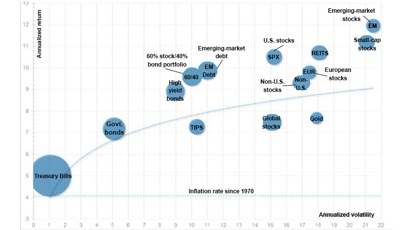
One of the core concepts in finance is the relationship between risk and return. The higher the risk of an asset, the higher the EXPECTED return. EXPECTED is an important term here because there are no guarantees. For those who say “I should invest in the riskiest start-up since that is going to produce the highest return, well, if history is any guide most of those start-ups will fail so probably best to invest in a basket of them (aka “spray and pray” approach) and hope that the big winners make up for the large percentage of losers where you will lose all of your money. This is why venture capital firms (who invest in start-up companies) invest in 40-50 companies in their funds.
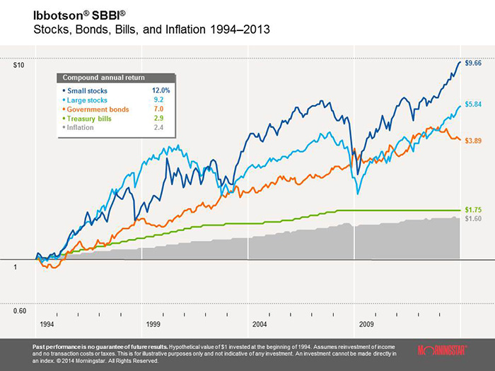
Back to the chart. The x axis measures a factor called “annualized volatility.” Think of that as the answer to “how much does the price of that asset change over the course of the year?” OR “How much TUMS will I need if I track the daily price movements (never a good idea)?” To get a better sense of what volatility looks like, here is a chart courtesy of Ibbotson’s that shows price changes for a variety of assets including small stocks, large stocks, government bonds, treasury bills and inflation. Which asset class had the sharpest price swings? Which asset had the greatest return over this 20 year period (1994-2013)? In this example, small stocks exhibited the most risk (volatile price swings) and earned the highest return:
Back to the bubble chart on the top of the page. The Y axis measures annualized return for the period 1970-2016, or how much did the value of the asset increase over the course of the year. So, reading from the left, Treasury Bills (debt of less than 90 days issued by the US Treasury) had the lowest annualized return (about 5% per year which seems amazing in these days of 0.25% Treasury bills) and the least price volatility (about 1% annualized). T-bills are generally considered a risk-free investment although at current rates, investors are risking that they are losing purchasing power with inflation at 2-3% running higher than T-bills which earn 0.5%. Moving from left to right, one can see that as risk increases (as measured by volatility), return increases also.
How to explain the anomalies? For example, global stocks and U.S. stocks both have similar levels of risk (annualized volatility of about 15%, but the U.S. markets have far outperformed global stocks as measured by the distance between their two bubbles on the chart. No simple explanation here other than conditions in US have been more positive for corporate earnings growth than conditions in Europe and Japan over the past 45 years. For the most part, though, you will see an upward trending line to reflect that as you take on increased risk assets tend to have higher returns.
Based on this information, many young investors will feel that they should invest in the assets expected to have the highest returns, which historically would be small cap stocks (think smaller companies). What they neglect to take into account however is their ability to tolerate risk. Will they maintain their investment strategy at the first sign of a slump in stock prices (which tend to be sharper in small stocks)? You can’t look at returns in a vacuum as selling at the first sign of weakness often leads to investors missing the upward trend. Hopefully these two charts provide some context for your students to understand the relationship between risk and return.
About the Author
Tim Ranzetta
Tim's saving habits started at seven when a neighbor with a broken hip gave him a dog walking job. Her recovery, which took almost a year, resulted in Tim getting to know the bank tellers quite well (and accumulating a savings account balance of over $300!). His recent entrepreneurial adventures have included driving a shredding truck, analyzing executive compensation packages for Fortune 500 companies and helping families make better college financing decisions. After volunteering in 2010 to create and teach a personal finance program at Eastside College Prep in East Palo Alto, Tim saw firsthand the impact of an engaging and activity-based curriculum, which inspired him to start a new non-profit, Next Gen Personal Finance.
SEARCH FOR CONTENT
Subscribe to the blog
Join the more than 11,000 teachers who get the NGPF daily blog delivered to their inbox:
MOST POPULAR POSTS
3